Visualizing Branch Coverage
One of the reasons NCover features both sequence point coverage and branch coverage numbers so prominently is that they are both essential to understanding the coverage picture for your project. Sequence point coverage relates directly to your code, so by looking at the code with coverage data overlaid, it's easy to see which specific lines of code have not been tested.
Branch coverage is a better overall metric because it scales directly with the complexity of a method and can't be distorted by the verbosity of your code the way that sequence point coverage can. So, if branch coverage is a better metric, then why do we even look at sequence point coverage? The main reason is that branch coverage is calculated directly from the compiler generated code, and the connection between the code and what is generated by the compiler is not always clear-cut or easy to visualize.
The primary value of branch coverage is to measure how much of your program's structure is being exercised by your tests.
The primary value of sequence point coverage is to find the lines of code which are not being executed and are contributing to a lack of coverage.
We've had many customers ask us to explain how the branch coverage numbers were being calculated for a given method. So, we created a technique to visualize branch coverage in the left margin of a method in the coverage display window. Let's dive into an example here and describe how to interpret the diagram.
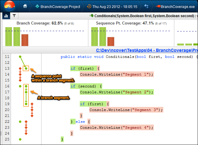
First, notice at the top of the window that our branch coverage is at 62.5% with 5 of 8 segments covered. The sequence point coverage is at 47.1% with 8 of 17 sequence points covered. The dots and line segments on the left side of the screen demonstrate those metrics visually. Each green dot represents a covered sequence point, and a red diamond represents an uncovered sequence point. If you count them up, you'll see 8 green dots and 9 red diamonds for a total of 17 sequence points. The branch segments are shown by connecting the dots and diamonds with arrows. You'll see 8 groups on the left, with 3 red and 5 green for a total of 8 branch segments.
The sequence point markers are usually setup on the same line where the sequence points occur to make it obvious where they are. In addition, if you hover the mouse over a sequence point marker, or the code corresponding to it, we add additional information. The branch segment will have arrows showing which other segments flow into it and which other segments flow out.
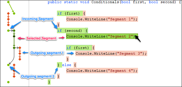
In the screenshot above, the mouse is hovering over the Console.WriteLine("Segment 2"); line. You will notice that on the left, that the segment containing that code is highlighted in a slightly darker shade of green. The sequence point corresponding to that point is a darker green. There are only three sequence points in that branch segment. At the top you see a single arrow showing that the only way to run that segment of code is to branch there from the if (second) segment. At the bottom of the segment, there are two arrows showing that there are two ways to exit this segment. Depending on the value of the if (first) test, it can either execute the Console.WriteLine("Segment 3") segment, or it can skip past that to the end of the enclosing if block.
Exploring the branch diagram with the mouse makes it easier to understand what the branching structure of a method and what the coverage data really means. Hopefully this makes it easier for you to figure out how coverage is being calculated and why a particular section of code may not be covered by your tests.